Black SheepJiu Jitsu
Brand system, marketing site, CRM, and billing platform for the North Bay's premier Brazilian jiu jitsu academy. Every part of the business runs through it.
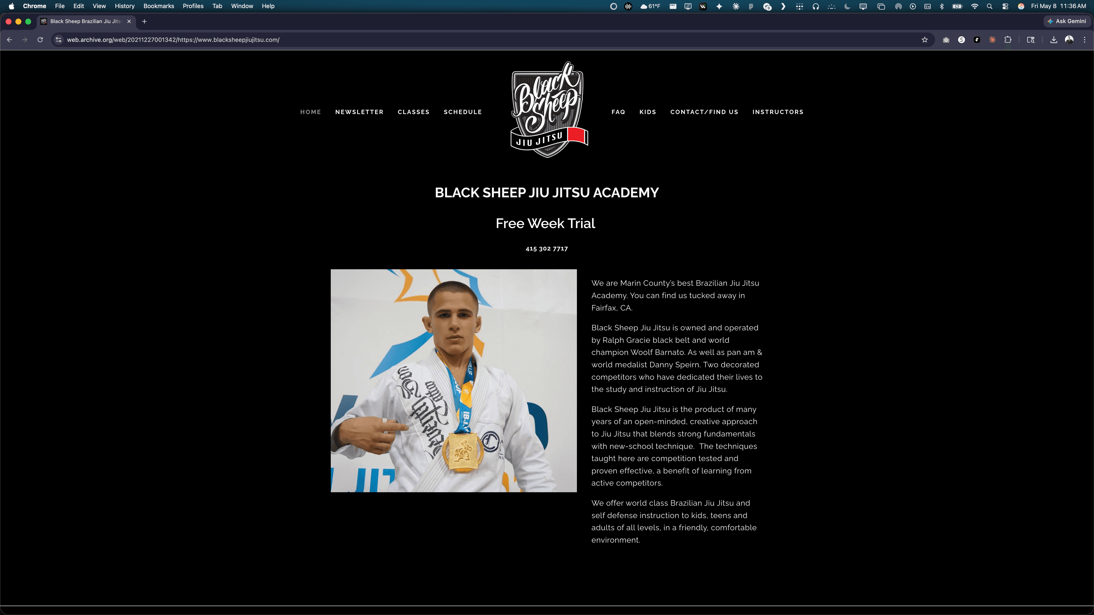
When I started, the academy was running on a free Squarespace site, a paper ledger, and a card reader. One of the coaches punched credit card numbers into it between rounds. The instruction was world-class. The business operating it was held together with rubber bands. Closing that gap meant rebuilding brand, site, and operating platform end-to-end.
From → To.
Black Sheep had a different story than most BJJ academies. Two decorated competitors, a real curriculum, a serious mat. But the surface a new student touches — first impression, signup, payment, family management, summer camp enrollment — was all manual, all paper, all bottleneck.
The work wasn't a logo refresh. It was rebuilding the entire surface so the operations could match the quality of what happens once you're inside the door.
Challenge.
Replace every member-facing surface end-to-end without breaking what worked — solo, covering agency, engineering, brand, and ops.
Extend the existing logo into a system usable everywhere. Avoid the genre's defaults — snarling animals, fists, fight-poster type. A marketing site that converted cold visitors into trials without a single hard-sell pattern. A real platform behind it — accounts, billing, plan management, family memberships, summer camp signups — replacing the manual back-office. And a migration path that didn't lose a single existing member or interrupt billing.
The logo was already great. The system around it — and the operations behind it — was the actual job.
Approach.
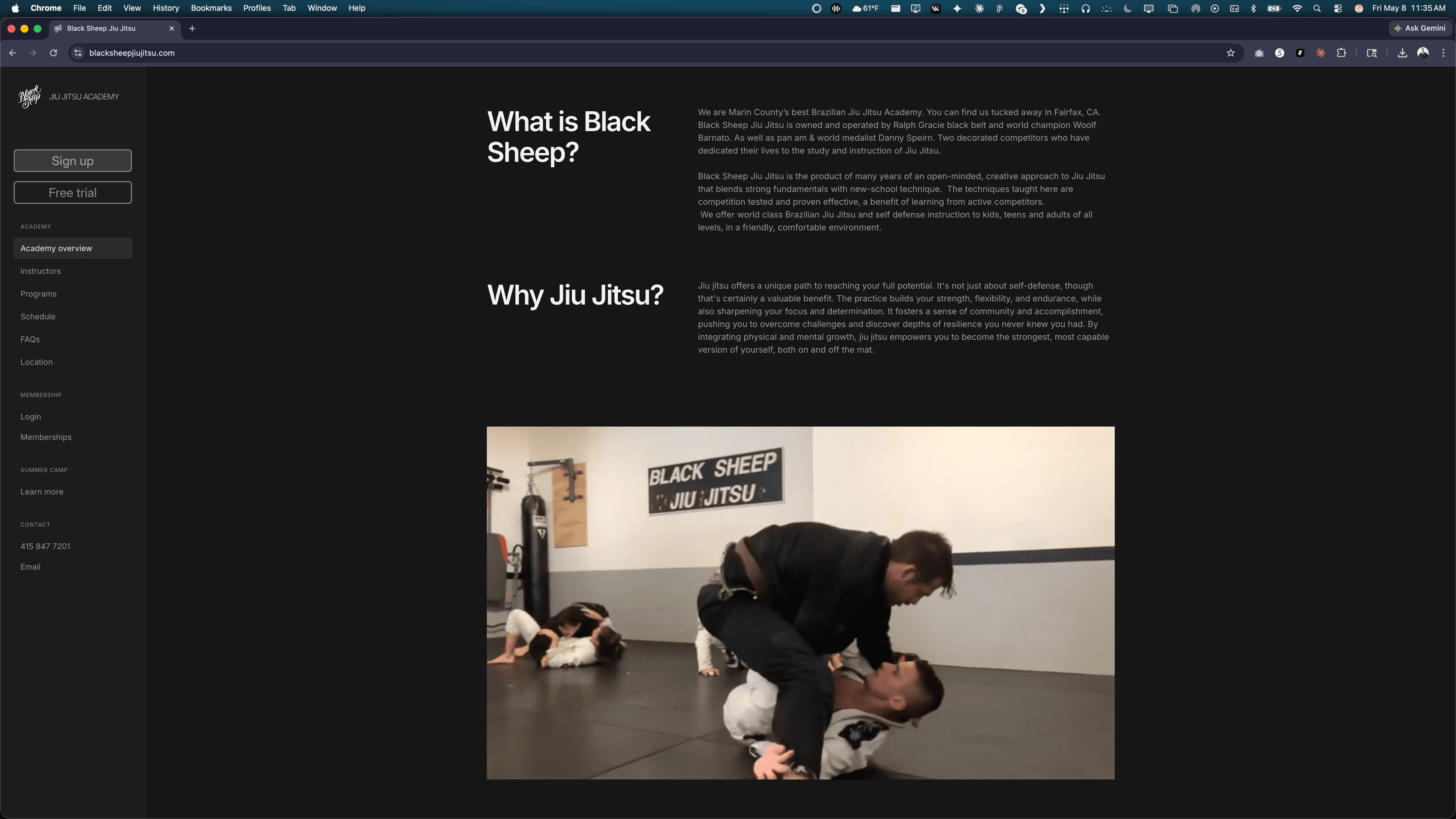
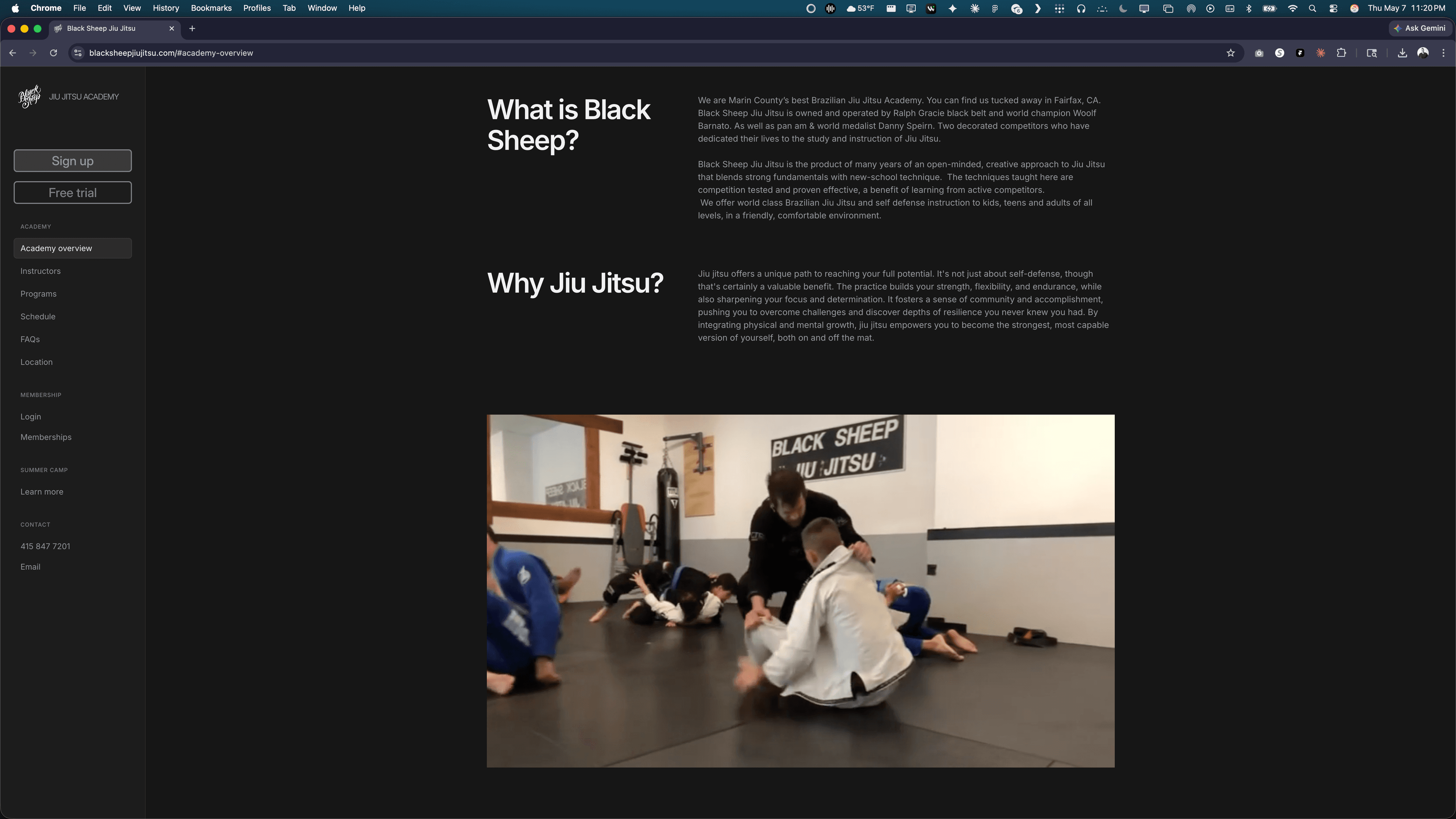
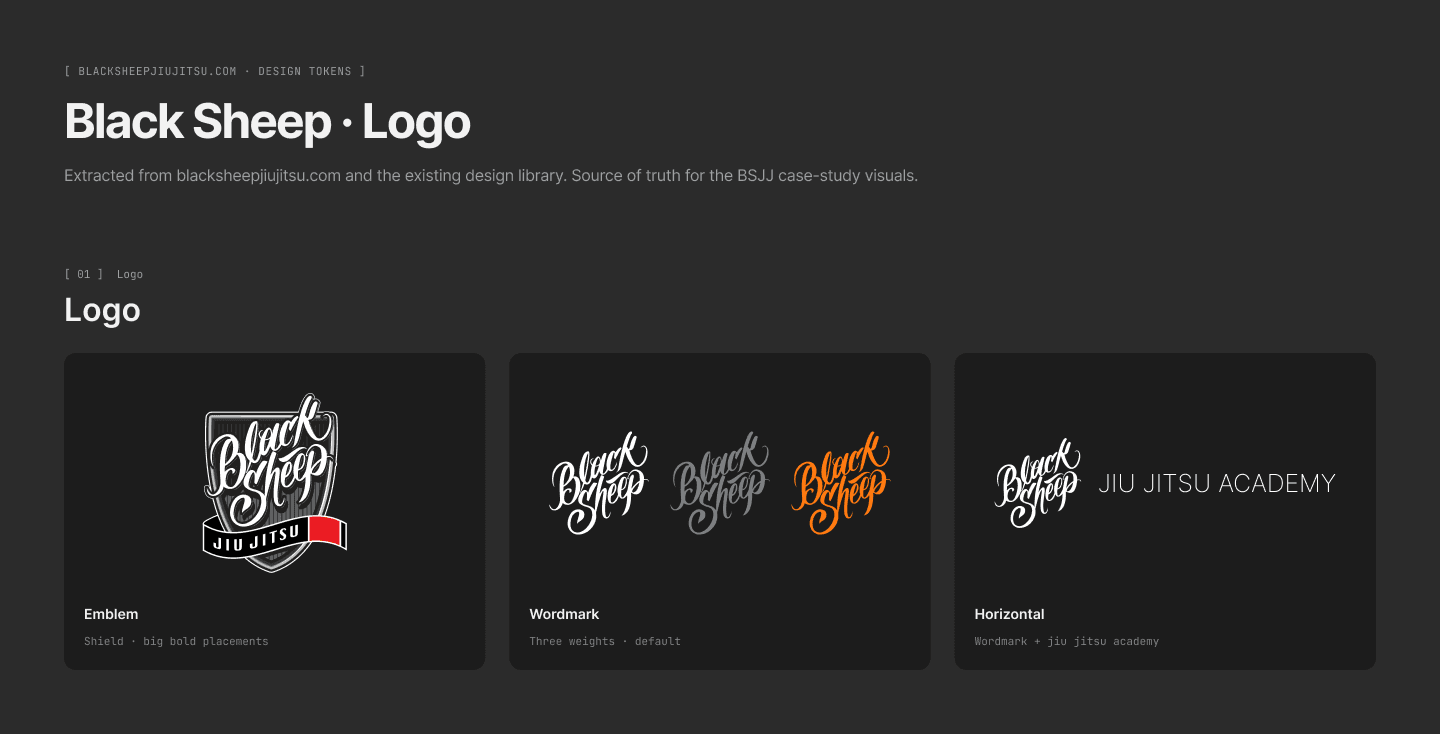
Brand — system around an existing mark. The academy already had a strong logo. What it didn't have was the rest of the system: a primary lockup with the discipline name, alt lockups for square and condensed surfaces, a typeset that paired cleanly with the mark, a low-saturation palette, photography that framed the academy like a workshop instead of a fight gym. Where the genre defaults to threat displays, the system defaults to focus.
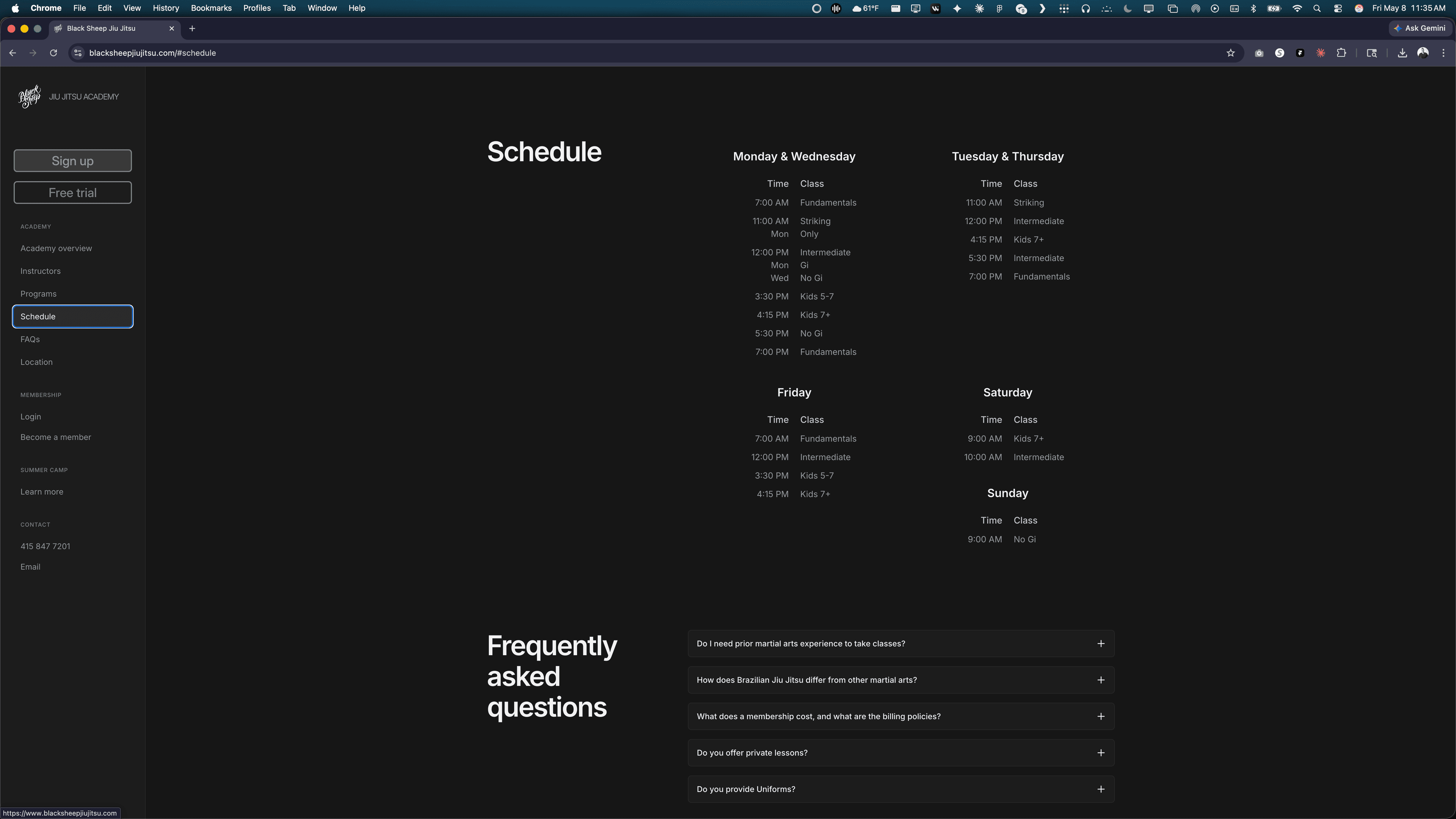
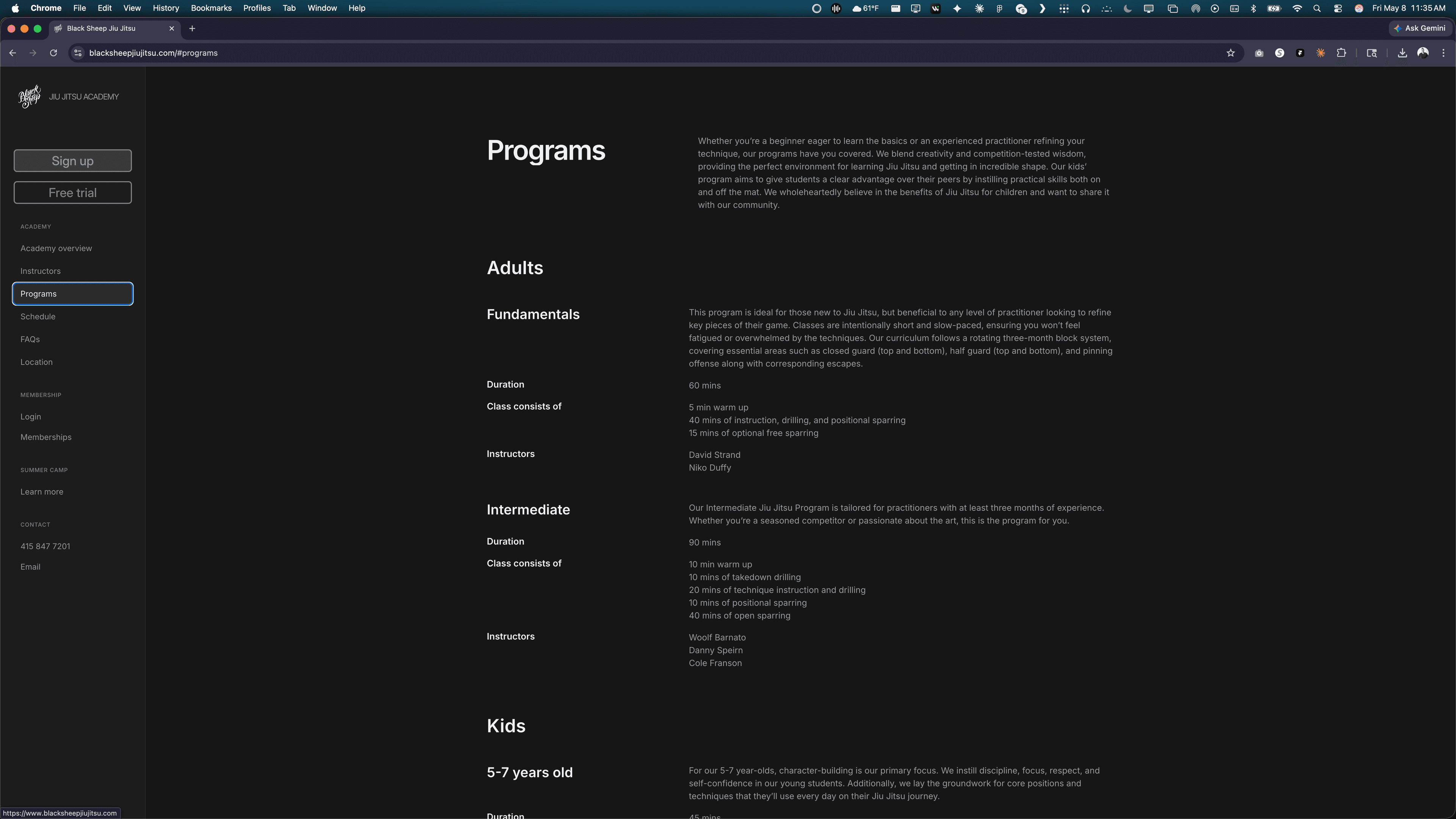
Site — credibility before conversion. The homepage opens on instructor pedigree because that's what a serious prospect actually researches first. Programming, curriculum structure, and class formats come next. The free-trial CTA waits until the visitor has a reason to take it.
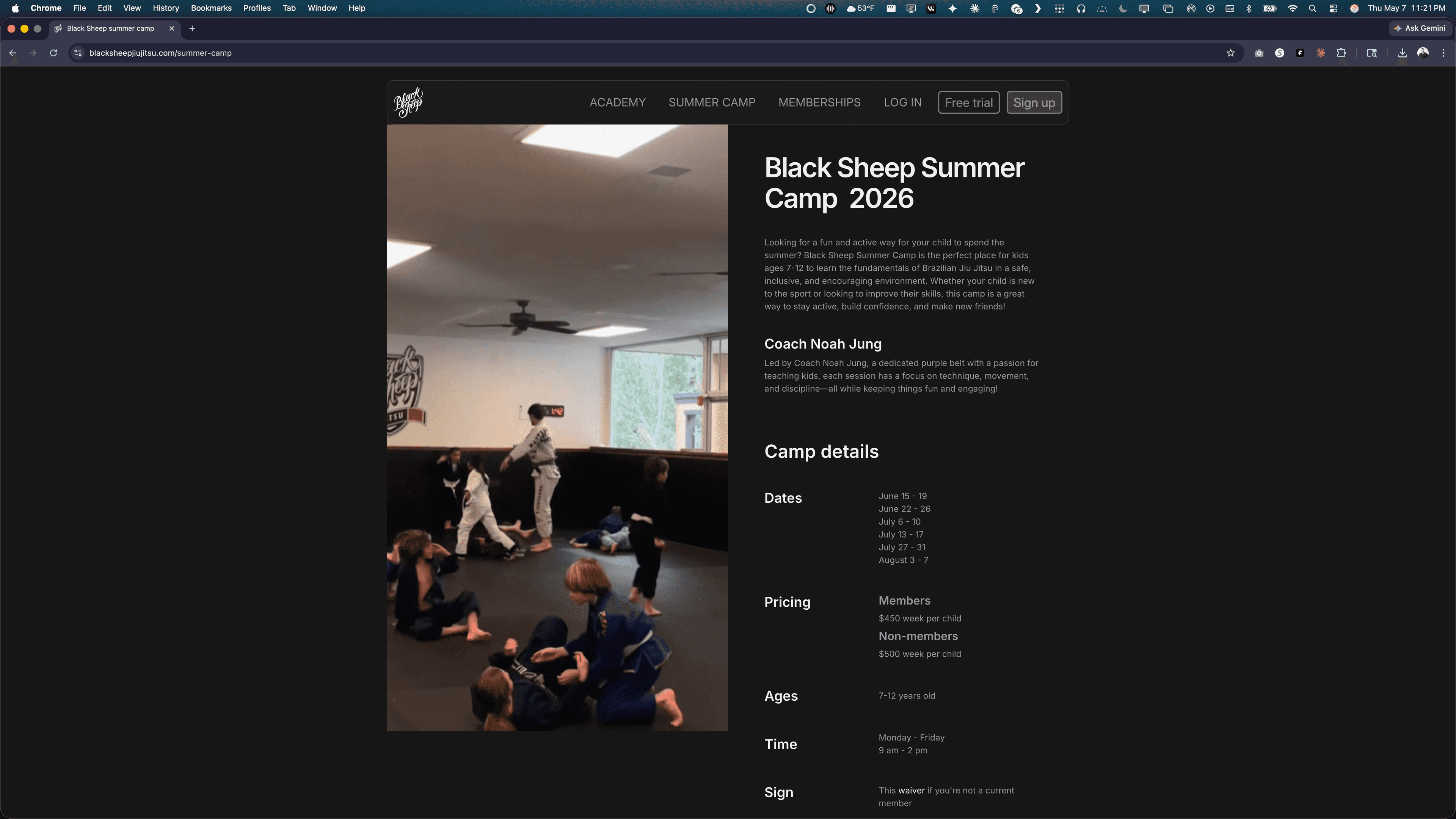
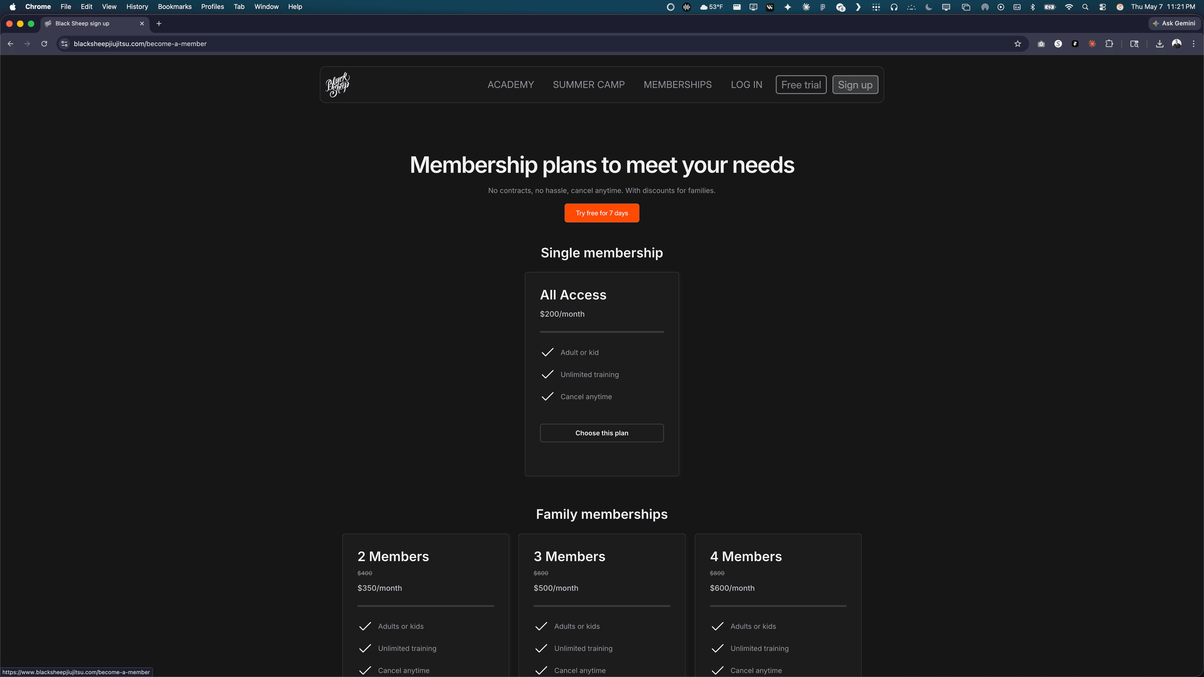
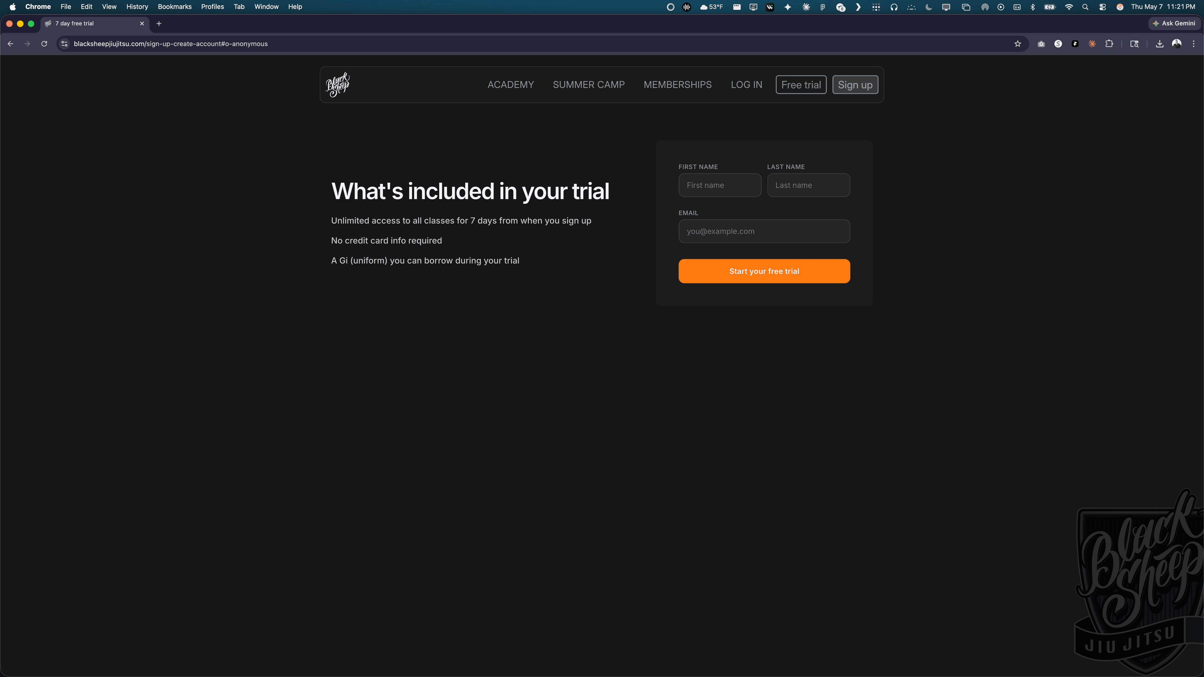
Platform — Framer + Outseta. Framer for the marketing surface so the brand stays editable in the owner's hands without an engineer in the loop. Outseta underneath for accounts, payments, plan changes, family billing, and summer camp registration. The whole stack is something the academy can run without me.
Migration without downtime. Existing members were ported over with their billing relationships intact. No re-entry of card data. No gap in collection. The academy went from manual to fully automated in a single switchover.
What shipped.
A brand system built around the existing logo — primary and alt lockups, color, type pairing, photography direction, and a documented brand standard. Marketing site on Framer. Member platform on Outseta — accounts, recurring billing, plan management, family memberships. Self-serve enrollment for individuals, families, and summer camp. Photography direction and on-mat shoot. All the copy.
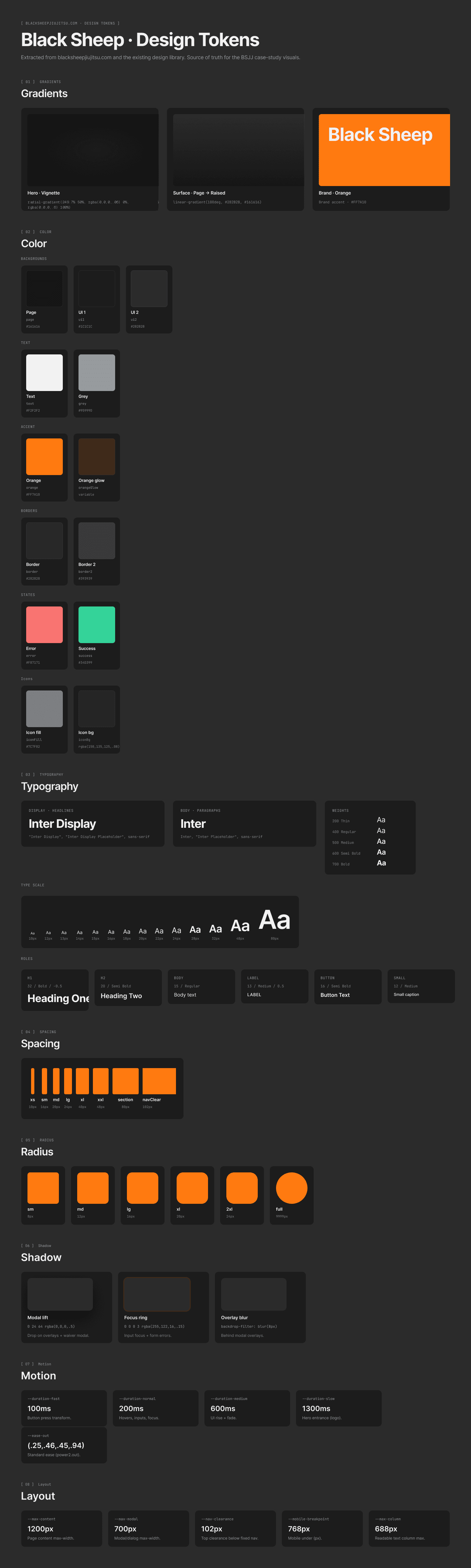
Design tokens.
What changed.
100%
Manual back-office work eliminated — card-by-hand entry, paper rosters, ledger reconciliation. Coaches coach again.
Self-serve
Signup live for individuals, families, and summer camp — no human on the other end.
32
Kids self-enrolled in summer camp's first online season — phone-call coordination became a tracked revenue line.
Zero
Billing interruptions during the migration.
The interesting design decision wasn't visual. It was scope. I could have built a brand book around the existing logo, shipped a nicer Squarespace, and called the engagement done. The actual lever was further down the stack — the moment a stranger decides to try the academy, the moment a parent enrolls a kid in summer camp, the moment a card gets charged.
Black Sheep is the case for treating a small business like a product. The brand is the surface. The platform is what the brand is actually made of.
I automated the parts of the business that had no business being manual — so the parts that should stay manual, first impressions, mat time, coaching, could be.
[Next case study]